January 2026
IMAGINARY SPACES
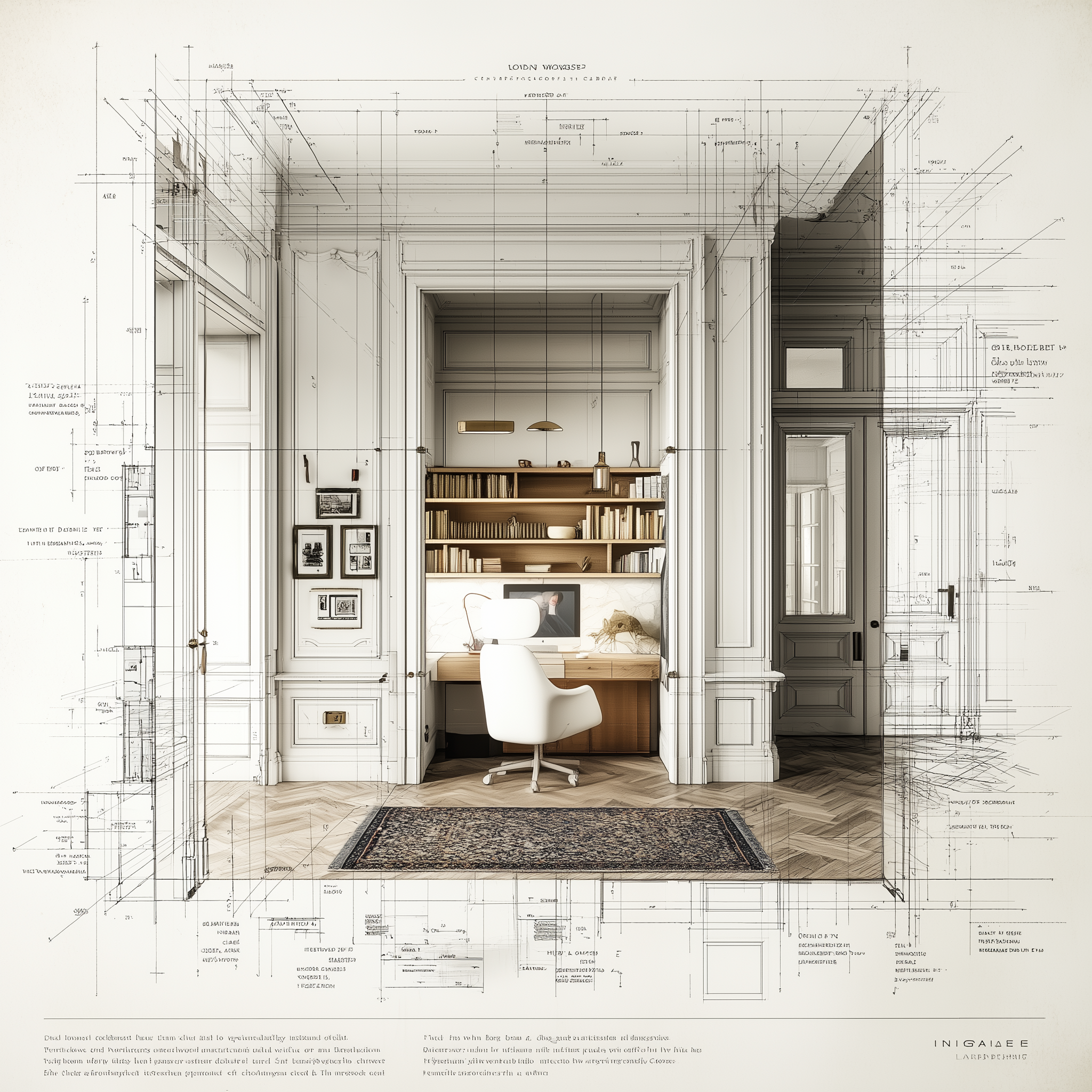
PARISIAN ENTRYWAY MEETS MODERN UTILITY
AI-generated image
WHY THIS IMAGE WORKS
Old architecture + modern insert = instant sophistication
The classical shell (moldings, proportions, symmetry) is deliberately paired with:
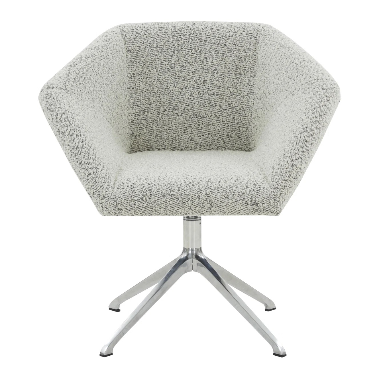
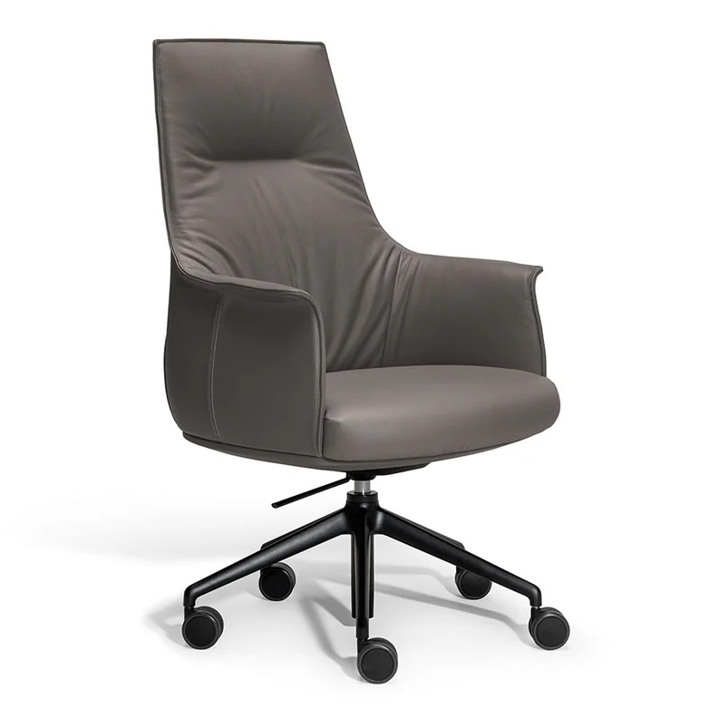
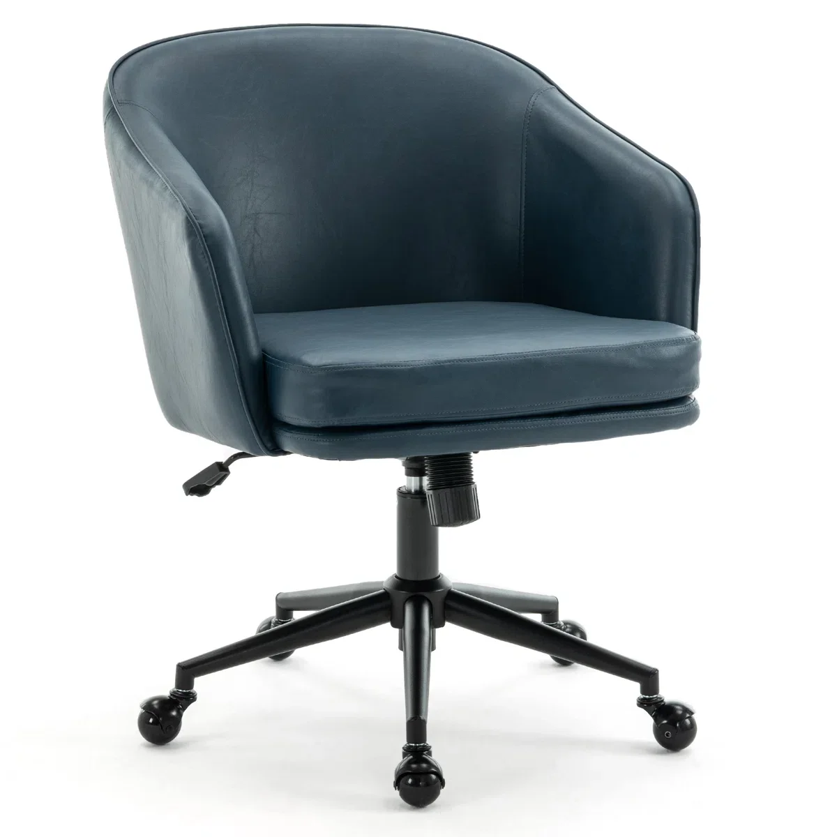
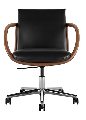
Modern chair
Clean-lined desk
Minimal accessories
Styling tip:
If your space has historic bones, don’t “match” them with antique furniture everywhere. Instead:
Let architecture be the ornament
Keep furniture modern, quiet, and sculptural
This contrast is what makes the room feel current instead of museum-like.
The recessed niche is doing the heavy lifting
The desk lives in an architectural recess, which:
Creates focus
Makes the workspace feel intentional
Allows clutter to feel contained
Styling tip:
If you don’t have a niche:
Fake one with floor-to-ceiling shelving
Or frame a desk with tall cabinets or paneling
Your brain loves “rooms within rooms.”
Symmetry is calm, asymmetry is personality
The architecture is highly symmetrical. The styling gently breaks it:
Books arranged imperfectly
Objects placed casually
Chair slightly off-center in spirit, not structure
Styling tip:
Use symmetry for:
Walls
Built-ins
Major furniture placement
Use asymmetry for:
Accessories
Art
Shelf styling
This balance keeps spaces from feeling staged.
If you want to recreate this feeling at home start with these rules:
One quiet color palette (whites + wood)
One strong architectural gesture (paneling, niche, framing)
One modern contrast piece
Nothing unnecessary at eye level
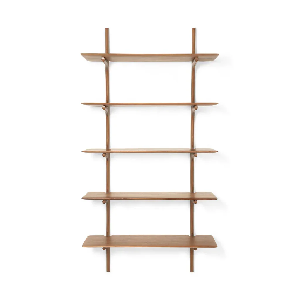
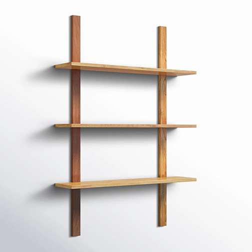
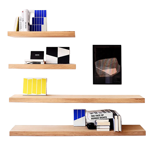
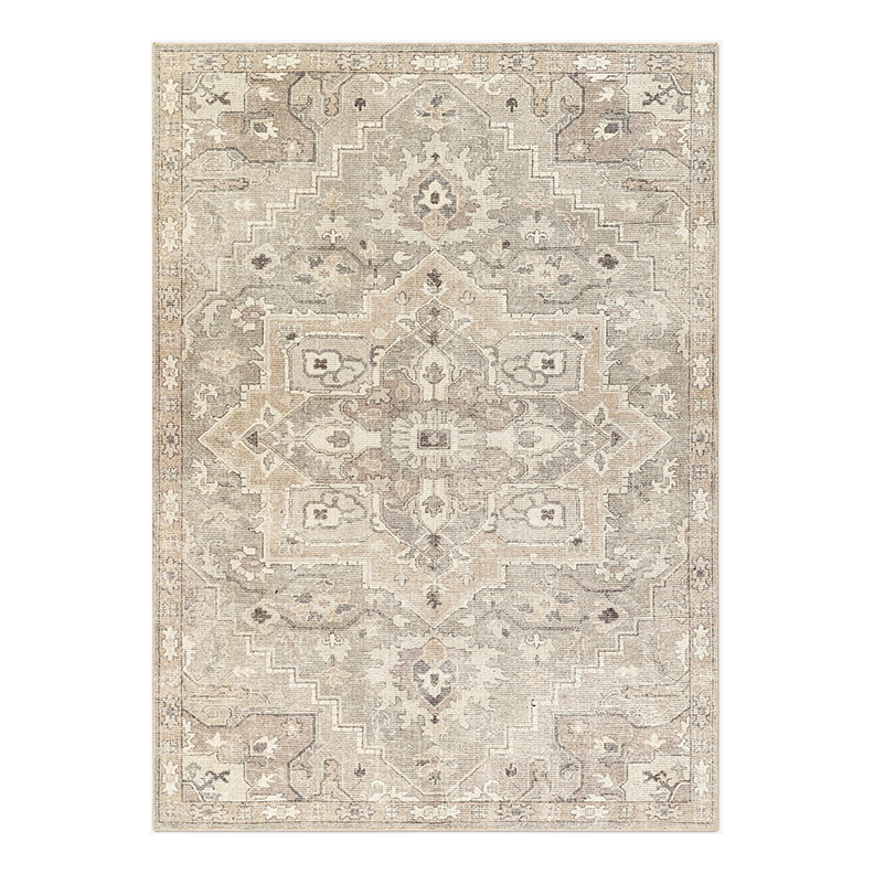
RECOMMENDATIONS